Night at the Musuem
What We Did Well:
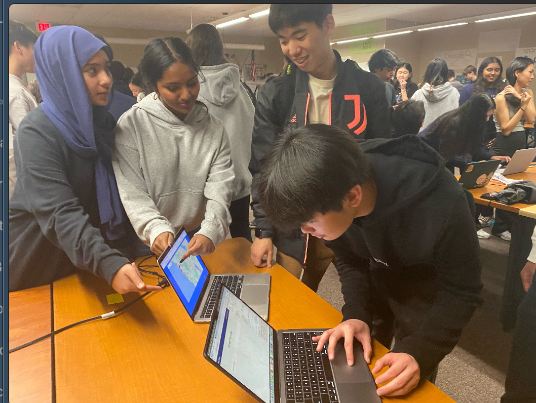
- Demonstrated all features effectively: real estate search, AI bot, add to favorites, etc.
- Presented as a cohesive team, showcasing our collaboration and passion.
- Answered audience questions confidently, showing our preparation and knowledge.
Areas for Growth:
- Improve user interface (UI) for better visual appeal and ease of use.
- Dive deeper into technical aspects during the presentation, explaining algorithms and data analytics.
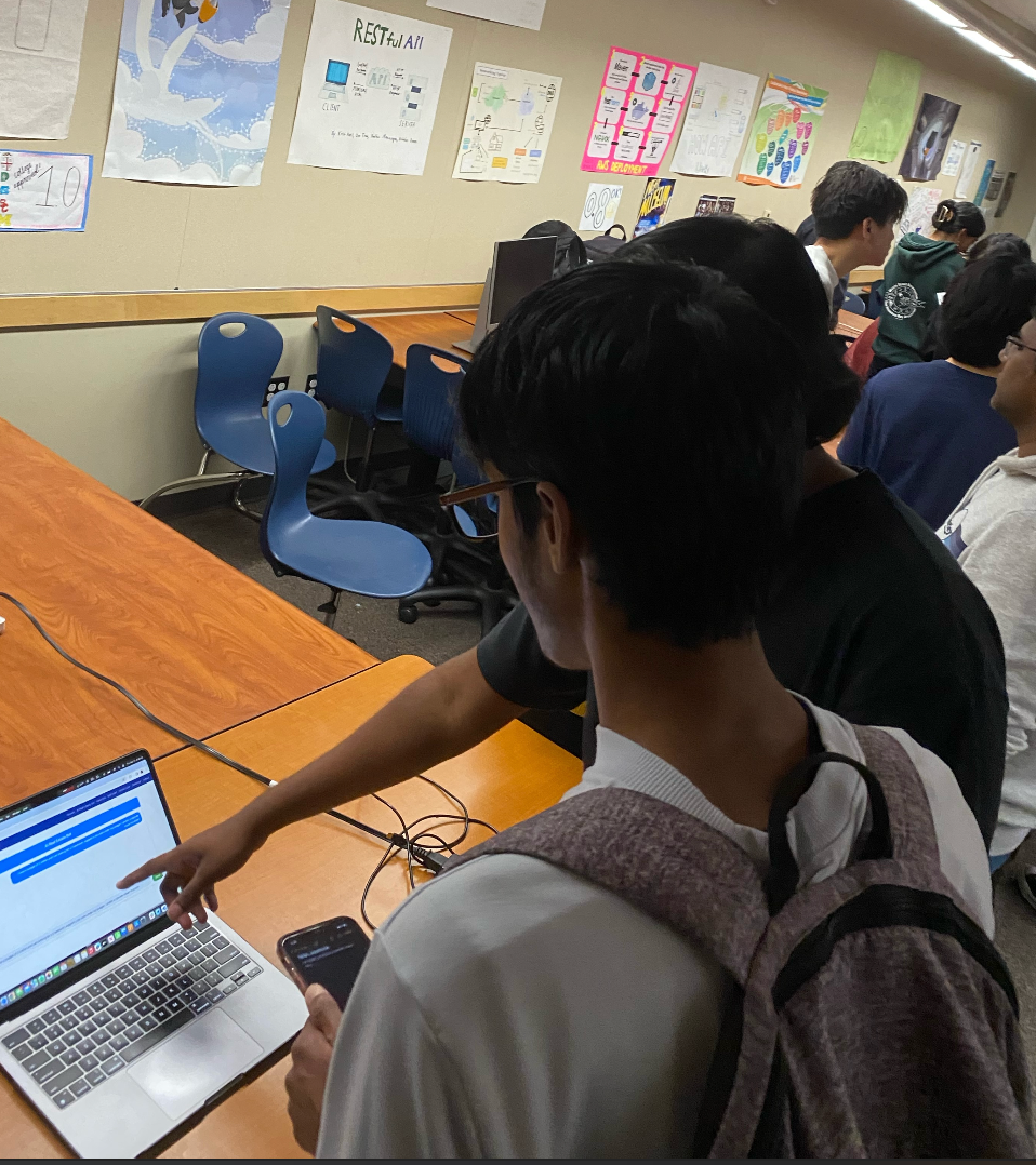
I saw a CSP project which was a website where you can find jobs. I was very impressed by the clean frontend design and the different features the project had. Although the idea was simple, it was well executed in all its features (e.g. inputting users, display users, sorting users, etc.)
Something that impressed us
Another project I saw was a stock analyzer. They trained their model real time to get together predictions compared to the actual stock price. They also had a feature where you could input a stock and it would give you a prediction of the stock price in the future. I was very impressed by the project and the way they presented it. They had a very clean and simple UI and the way they explained their project was very clear and concise.
We also found a project where it allowed teachers to publish their classes and assignments. It allowed for students to collaborate as a team and work on the same project. It was a very well executed project and the way they presented it was very clear and concise. They had a very clean and simple UI and the way they explained their project was very clear and concise.
Feedback
From other peers and parents we had good feedback. one thing they said was that we can fix up the UI because not everyone cares about the raw backend. In websites like google and yahoo backend does majority of the work but we only care about how the frontend looks and operates. So we decided that we would fix up the UI a bit.
